BRANDING & DESIGN
The logo is the signature. The brand is the handwriting.
People rarely know you by your logo. They know a colour that keeps coming back, a way of shooting, a line you always say the same way. We build that whole handwriting. And set it down so it holds when we’re not in the room.
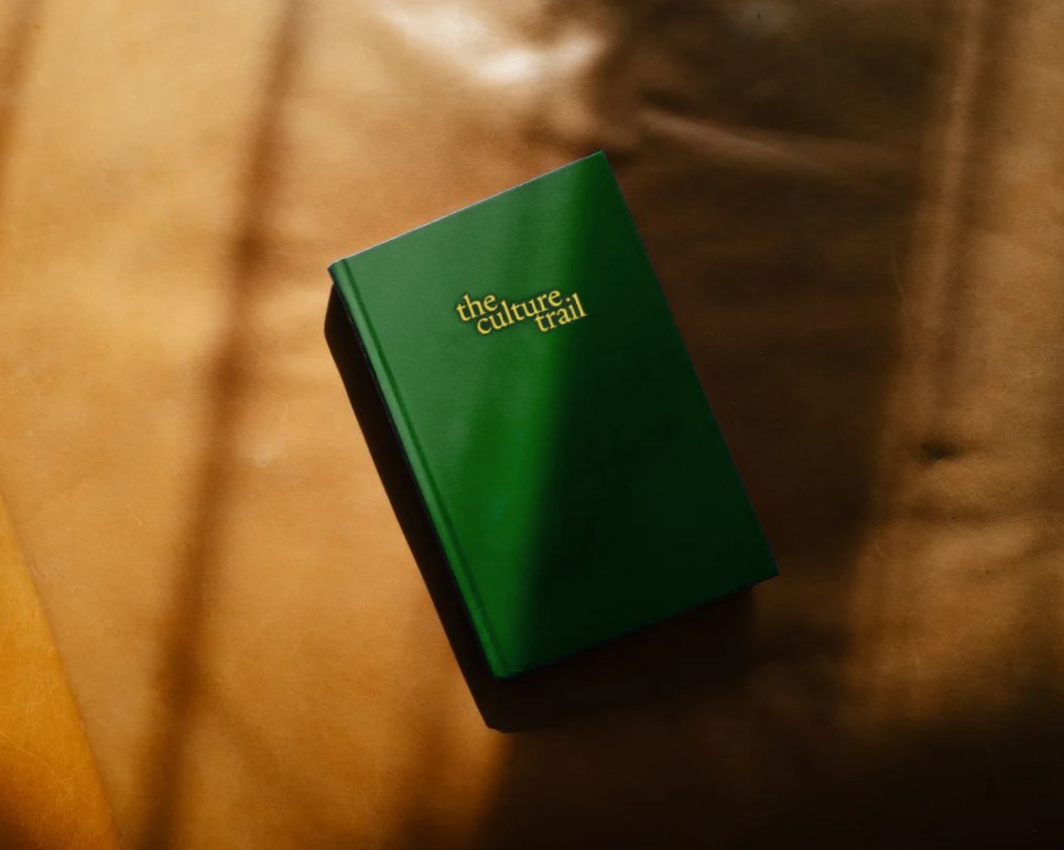
How it works
Five steps. The first one produces no pictures at all.
01
First, see what already works.
We lay out what exists: logo, colours, photos, the way you talk. Usually half of it is fine. Binning everything is expensive and rarely needed.
02
A brand is a thought first.
Before any form, we settle what you stand for. And what you don’t. The second part matters most. A brand gets sharp from what it refuses.
03
Form is made on material.
A logo on a white screen says little. We put it on paper, a facade, packaging, a phone. If it holds up there, it holds up for real.
04
Set down to last.
You get a brand book your printer, your photographer and your intern can all read. The logo and its clear space. The colours and their codes. The type and its weights. Examples of right and wrong.
05
We guard it. Until you do.
For the first months we check what goes out. Not to correct you. You only know a handwriting once you’ve written it a few times.
The photos that go with your handwriting? We shoot them ourselves. See photography.
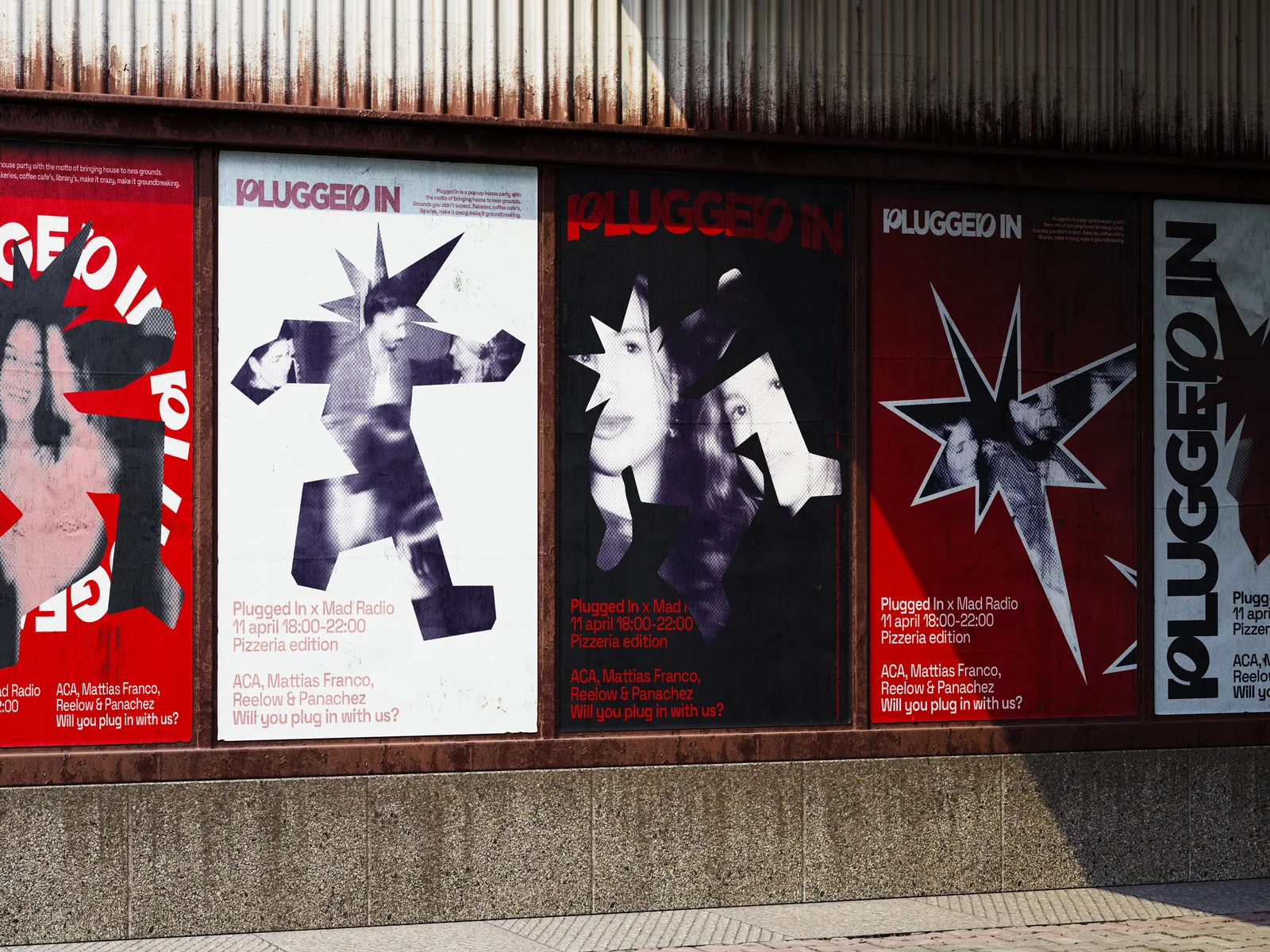
The Uchu Way · brand identity
A language, not a logo.
Set down in an Identity System Documentation. Strategy, wordmark, social layouts and print. One document.
SEE THE CASEThree questions. Then you know where we’d start.
Being here answers the first one: it’s about your brand. The rest takes twenty seconds. You get advice you can retell.